 Support
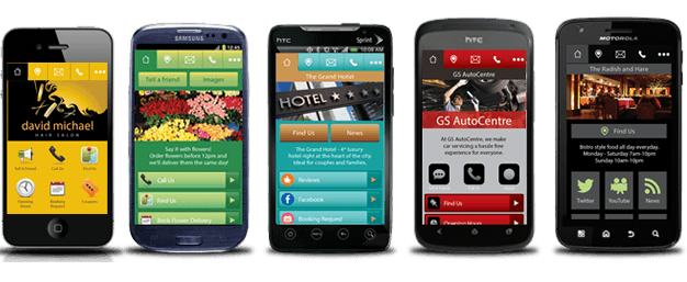
Mobile Ready Website
WHAT DOES “RESPONSIVE” MEAN?
Web designers can choose from a number of different methods to provide mobile visitors with an optimal viewing experience from any device. The most common approach used today is the ‘classic’ Responsive Web Design (RWD) approach. It’s also possible to choose other approaches, like adaptive design, or RESS (Responsive Web Design with Server Side Components).
Responsive Web Design is a technique in which websites automatically rearrange their content (text, graphics, videos and more) according to the width of the browser minimizing re-sizing, panning and scrolling. An RWD site sends the same HTML, CSS and Javascript to any device that requests content, and the rearrangement happens on the viewers side by their browser. To find out if a website is responsive, you can change the size of desktop browser’s window. If the content rearranges itself on-the-fly to fit the smaller window, this means that the website utilizes RWD.
However, there is one more way. Adaptive design creates brand new experiences for the user based on which device they visit from. There is a fundamentally different code base for each type/size of device expected to visit. This allows highly optimized versions of a site to be tailored for each visitor.
goMobi uses a combination of adaptive and responsive techniques. Using DeviceAtlas to identify which device is accessing the site, goMobi is able to respond with a device appropriate version. Responsive techniques are used to do the fine tuning between different device sizes – saving time and data, providing users with lightweight, beautiful sites that are just as feature rich, but a lot more performant than a heavy RWD site.
